It’s funny what a few days can do for your perception. I did a full play through a few days back and was fairly happy with the lighting and the general overall look and feel of the FD levels. Then, I got into the weeds of fixing a bunch of bugs and last night I did another play through… and was not so happy with the lighting in Firedrake.
When I first started deving firedrake I was targeting the S6 and S7 level of mobile hardware for the Gearvr. The specs for creating VR on these platforms is …well…somewhat less, shall we say, than deving on a full PC. So, my level designs and architecture had to be really simple to run well on these small, low power devices.
Since then, I have realized FD plays best on high performance devices such as the S9 and the Oculus Go and have bumped up the dev specs to handle these platforms, but that means that the levels still have the legacy of being developed for the slower platforms.
One saving grace is that Unity has a really robust and lovely lighting module. This allows me to really work on lighting the levels with some fun light sources and have all sorts of cascading shadows, light pools, and multi-colour lighting blends and the like to add some life to the levels. This type of lighting REALLY helps in hiding some of the simple level designs as well.
FD takes place primarily in dungeons and dank places, so I was always after a dark, shadowy low light type of atmosphere. I took a few months of trial and error to really figure out how to run and render the lights in the 3d levels effectively, but I think I have a pretty good handle on it now, but I noticed that many of my level designs ended up being somewhat “mono-chromatic”… meaning that one colour of light primarily took over.
Lighting can be a real science of its own and in 3d modeling or 3d game level design, trying to get the radioacity and light bounce right. Making sure the light source reacts well to the 3d object textures or working with the shadow cascades. It’s not uncommon to have full teams that do nothing but apply lighting to the levels and models of a game or VR experience. Well on this team, it’s just me and the surly Siamese cat….
It was planned from the start of experience design that each level, or in the case of Firedrake: The Catatombs of Doom, each cluster of levels, would have their own, unique lighting colours. I did this to help differentiate the quests and objectives within the game as a subtle UI element. Each main quest has its own colour. But in the play through last night, I noticed that the main colours actual “took over” and seemed to dominate the levels.
This felt wrong somehow….
So, I spent a few hours going through the levels and balancing out all the primary lights sources with some complimentary colour lights to balance them out. The end effect is a much more dynamic and visually interesting lay out I think. I still have some tweaking to do throughout the levels to really blend and make all the lights harmonize a bit better…. But it was a good first effort and a move in the right direction!
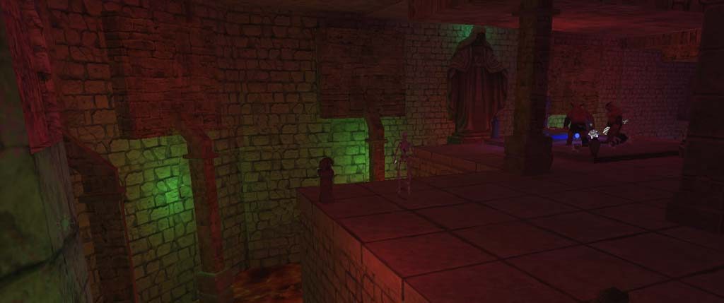
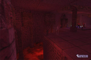
Image #1 The old lighting model from a week ago. These levels primarily used a red lighting theme. While it worked, it seemed to me that the red lights just took over and were somewhat uninteresting after a while.
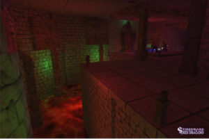
Image #2 The same level after adding a couple of green colour complimentary lights to balance the red lights. It’s far more visual interesting.


